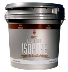
I was scanning my room for interesting fonts like Prof. Landes suggested, came across something that caught my eye. I have been thinking alot about original (or at least unique) font choices used to sell specific products for whatever reason. A lot of times the font in some subliminal way helps to sell the product.
Take the example to the right. This is a protein shake company, and the brand is known as isopure. This particular model is a zero carb formula to help keep calories down (that in fact is this company's staple product). The font is thin and tall, yet rigid and almost strong looking. The corners aren't right angles, but curved like a muscle would be. These would certainly be adjectives the person shopping for this product would be proud to demonstrate.
There are alot of examples of translatable type in the work out supplement field. What do you think? I'll post more as I come across them.
Thanks

Each font certainly has its own personality. This is a great example!
ReplyDelete