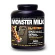
This brand is called muscle milk. They have a pretty standard font and type usage for their packaging. This particular product has a regular and a light version and I want to point out the differences of font for each of the products. The standard type (shown in black) is strong, all caps, bolded text written across one line. You almost have to turn the bottle to read the whole thing. The text is white on black background.
The light version is still bolded and all caps, but is more condensed, taller and skinnier, and the "light" tag is a script font in light blue. This one has white text on a white background. Everything about the light version feels lighter then the regular one. Another good subliminal packaging design using only type.


hey jared, what else does the "light" font imply?
ReplyDeleteI would say the light font implies that you will be lighter if you use this product. Or to say that this version is lighter in calories or fat or whatever, compared to the regular or other brands....
ReplyDeleteI think it is directly targeting the portion of the audience that is looking for that type of product
yes, but what else? think of the implications of gender.
ReplyDeleteOk, so if you think along the lines of gender, you could say (compared to the regular version) that this packaging, font and color choice could be geared twoards women.
ReplyDeleteThis is a generally male market I think. But the fact that this is called muscle milk light might be a direct attempt at diffusing the musclehead stereotype and getting at some of those untapped buyers.......
I still dont have it do I?