Saturday, September 26, 2009
Poor font combo choices
This one is sun screen packaging that came in the free back packs they gave out for safety week the day they kicked us out of the building for a half hour. I think the logo is nice, but the way they jammed "spf 30" on top of the logo, in a thick and short font is ugly. You can barely read it and it just distorts the effect on the text of the logo. I think this is what happens when using multiple fonts and/or distorting fonts goes wrong.
Monday, September 21, 2009
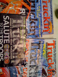
This is the magazine truckin' I get every month. I love the font they use for their header on the cover. I guess its their logo too. The n at the end is modified a but. they gave it sort of a descender and use that theme in other text throughout the magazine for a uniform look. They also change the color, 3-Dness, and texture to match the theme of the current issue (as you can see from the picture taken in the room. What do you think?
Tuesday, September 8, 2009
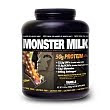
Another work out supplement typography example
This brand is called muscle milk. They have a pretty standard font and type usage for their packaging. This particular product has a regular and a light version and I want to point out the differences of font for each of the products. The standard type (shown in black) is strong, all caps, bolded text written across one line. You almost have to turn the bottle to read the whole thing. The text is white on black background.
The light version is still bolded and all caps, but is more condensed, taller and skinnier, and the "light" tag is a script font in light blue. This one has white text on a white background. Everything about the light version feels lighter then the regular one. Another good subliminal packaging design using only type.
Subscribe to:
Posts (Atom)