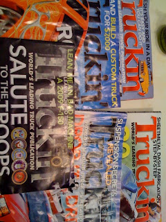
This is the magazine truckin' I get every month. I love the font they use for their header on the cover. I guess its their logo too. The n at the end is modified a but. they gave it sort of a descender and use that theme in other text throughout the magazine for a uniform look. They also change the color, 3-Dness, and texture to match the theme of the current issue (as you can see from the picture taken in the room. What do you think?

what I find myself considering is how they see the choice of this font as appropriate to their demographic? it's an interesting combination of the formalism of a serif font and the casual vernacular of "truckin' ". usually one doesn't use contractions in formal language. something else to consider is the history of customized vehicles and how the graphic language of this fits in that history.
ReplyDeleteI would say that compared to most other vehicle mod magazines, truckin has a more formal quality. In the vehicles they have in their pages and in the writing styles. There are constant discussion pieces about what it takes to be a cover or feature truck, that no part can be left untouched, etc. Maybe the formal serifed font (even with the "in' " abbreviation) is an attempt to show their self imposed superiority over the competition.
ReplyDelete