What do you think?
Tuesday, November 24, 2009
Welcome to Hollywood
i pass a sign like this everyday on my way to work off on 95 and sheridan, I kind of like the treatment on the y. its sort of their logo. but i dont like how the left arm of the y is chopped off, but the rest of it flows so nicely. I dont know im torn. And im not sure i like that the words "welcome to" and the word "florida" aren't in exactly the same style. 3-4 variations of font or style in one little sign is a bit much no?
Monday, November 16, 2009
I was working on a project in my photo 2 class where i needed to simulate a carving typography style with transparent paper and photo rc paper with an enlarger. I had good results and bad results, but i thought if one were to create an entire alphabet from these organic carvings (mostly just peoples initials in trees)(or sidewalks) it would make for a nice typeface.
also it would go good with out type and image projects....as mine came from sidewalk letters ironically.
Thursday, November 12, 2009
Wednesday, November 4, 2009
Thursday, October 29, 2009
Thursday, October 22, 2009
I think this one is up there with the A and E logo. It uses the same play of negative spaces, but I think that this one is less visually stimulating.
I think the reason is that although there is interaction of the background and foreground, they don't interact as much, or as well, as in the other logo in my previous post.
Friday, October 16, 2009
Wednesday, October 14, 2009
Cedar point is an amusement park in North ohio, very near where I am from. It is a place I am definitely going to seek employment after I graduate. The company that owns them, Cedar Fair, LLC, owns 10 or so other amusement parks around the world.
I have always loved the typography in their logo. The thick informal font, with the wavy baseline certainly reflects the mood of the place and the waving flag pretty much means amusement park wherever you go.
I wonder how much the rights to use snoopy in their logo costed...
Thursday, October 8, 2009
A&E TV
This is the A&E tv channel logo. I love how the negative spaces interact with the positive spaces and how this logo can look nice in many colors or styles.
On the way home from the boca campus yesterday I saw a construction company truck called H & E construction who had obviously plagiarized this a & E logo. But it was the nicest plagiarism i have seen in a long time.
Monday, October 5, 2009
Attached is a quick snapshot I took of the book private parts by Howard Stern. All in all I think its one of the funniest books ever written and I think Howard is a lot smarter then most give him credit for. I started reading it over the weekend because on his show (on satellite radio) they are on vacation and playing a lot of old tapes from past years (when the book was written) and it reminded me of them.
My typography point is, (and especially in the earlier years ) Stern had to be so whacky and outlandish to shock people that his stories are enough. It looks like a child's book with the 14 point font used. I think a regular size would have added some class to the way the hard cover looks overall.
Now that he is on uncensored radio, he far more mellow not needing to shock anyone to get attention and I think a better designed style in parts of his book would have caused that growth to come sooner. Does this make sense?
Saturday, September 26, 2009
Poor font combo choices
This one is sun screen packaging that came in the free back packs they gave out for safety week the day they kicked us out of the building for a half hour. I think the logo is nice, but the way they jammed "spf 30" on top of the logo, in a thick and short font is ugly. You can barely read it and it just distorts the effect on the text of the logo. I think this is what happens when using multiple fonts and/or distorting fonts goes wrong.
Monday, September 21, 2009
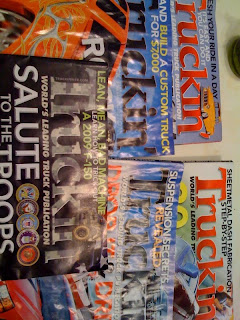
This is the magazine truckin' I get every month. I love the font they use for their header on the cover. I guess its their logo too. The n at the end is modified a but. they gave it sort of a descender and use that theme in other text throughout the magazine for a uniform look. They also change the color, 3-Dness, and texture to match the theme of the current issue (as you can see from the picture taken in the room. What do you think?
Tuesday, September 8, 2009
Another work out supplement typography example
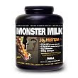
This brand is called muscle milk. They have a pretty standard font and type usage for their packaging. This particular product has a regular and a light version and I want to point out the differences of font for each of the products. The standard type (shown in black) is strong, all caps, bolded text written across one line. You almost have to turn the bottle to read the whole thing. The text is white on black background.
The light version is still bolded and all caps, but is more condensed, taller and skinnier, and the "light" tag is a script font in light blue. This one has white text on a white background. Everything about the light version feels lighter then the regular one. Another good subliminal packaging design using only type.
Tuesday, August 25, 2009
I was scanning my room for interesting fonts like Prof. Landes suggested, came across something that caught my eye. I have been thinking alot about original (or at least unique) font choices used to sell specific products for whatever reason. A lot of times the font in some subliminal way helps to sell the product.
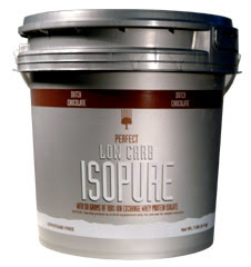
Take the example to the right. This is a protein shake company, and the brand is known as isopure. This particular model is a zero carb formula to help keep calories down (that in fact is this company's staple product). The font is thin and tall, yet rigid and almost strong looking. The corners aren't right angles, but curved like a muscle would be. These would certainly be adjectives the person shopping for this product would be proud to demonstrate.
There are alot of examples of translatable type in the work out supplement field. What do you think? I'll post more as I come across them.
Thanks
Subscribe to:
Posts (Atom)